Client
Rebrand
ZTE USA ![]()

Overview
As the world's 4th-largest mobile phone manufacturer and holds around 11% of the U.S. smartphone market, ZTE recognized the urgency to improve their US brand image through their online presence.
We were appointed to redesign the entire ZTE official corporate site as well as the e-commerce store. Here are 2 separate case studies to discuss some key sections in detail:
PDP

Challenge
The UX experience on a PDP (Product Description Page) can either make or break the sale. Our challenge was to understand friction caused in the sales process, to further reinvent a mobile-first PDP that is informative, fast, and navigation friendly, and provide a clear "Buy" CTA that can boost customer conversion rate and sales.
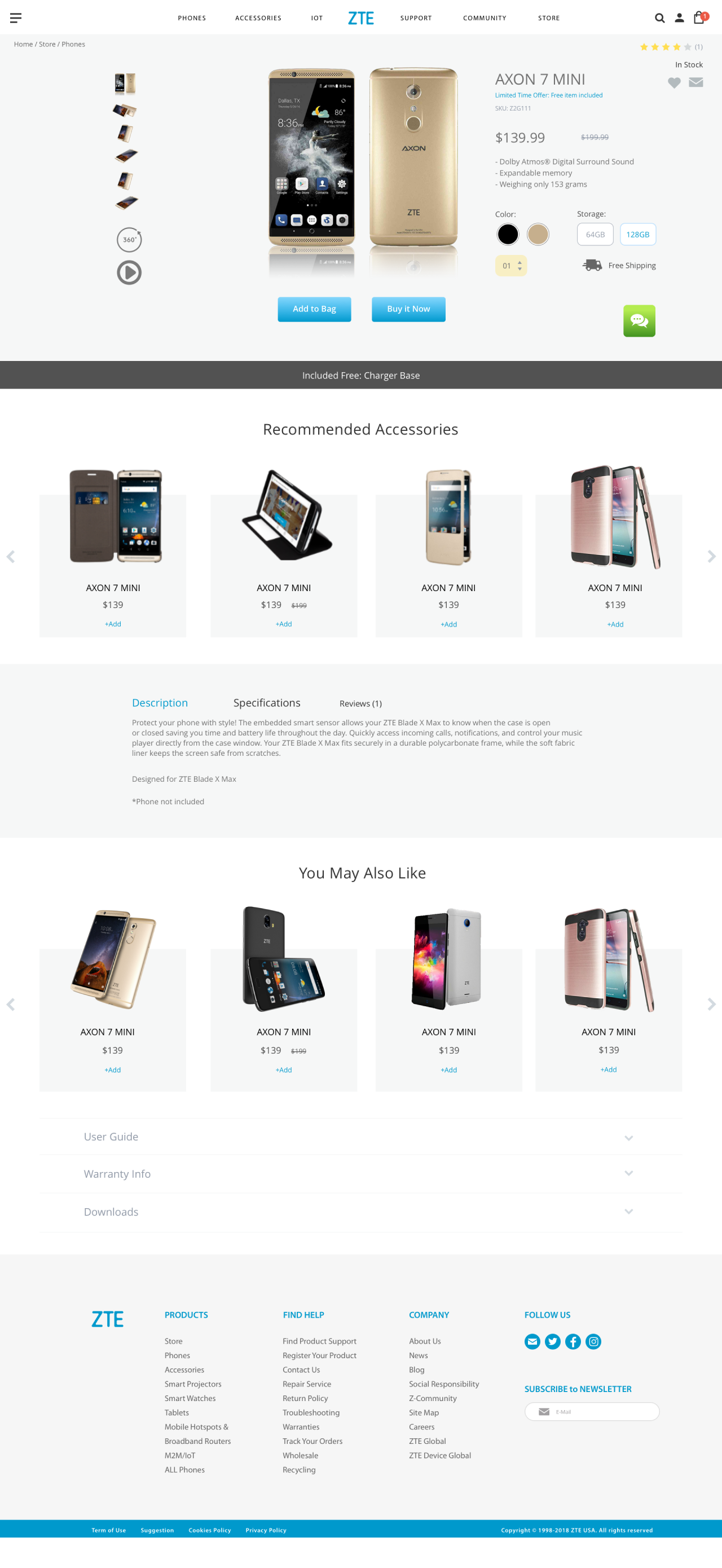
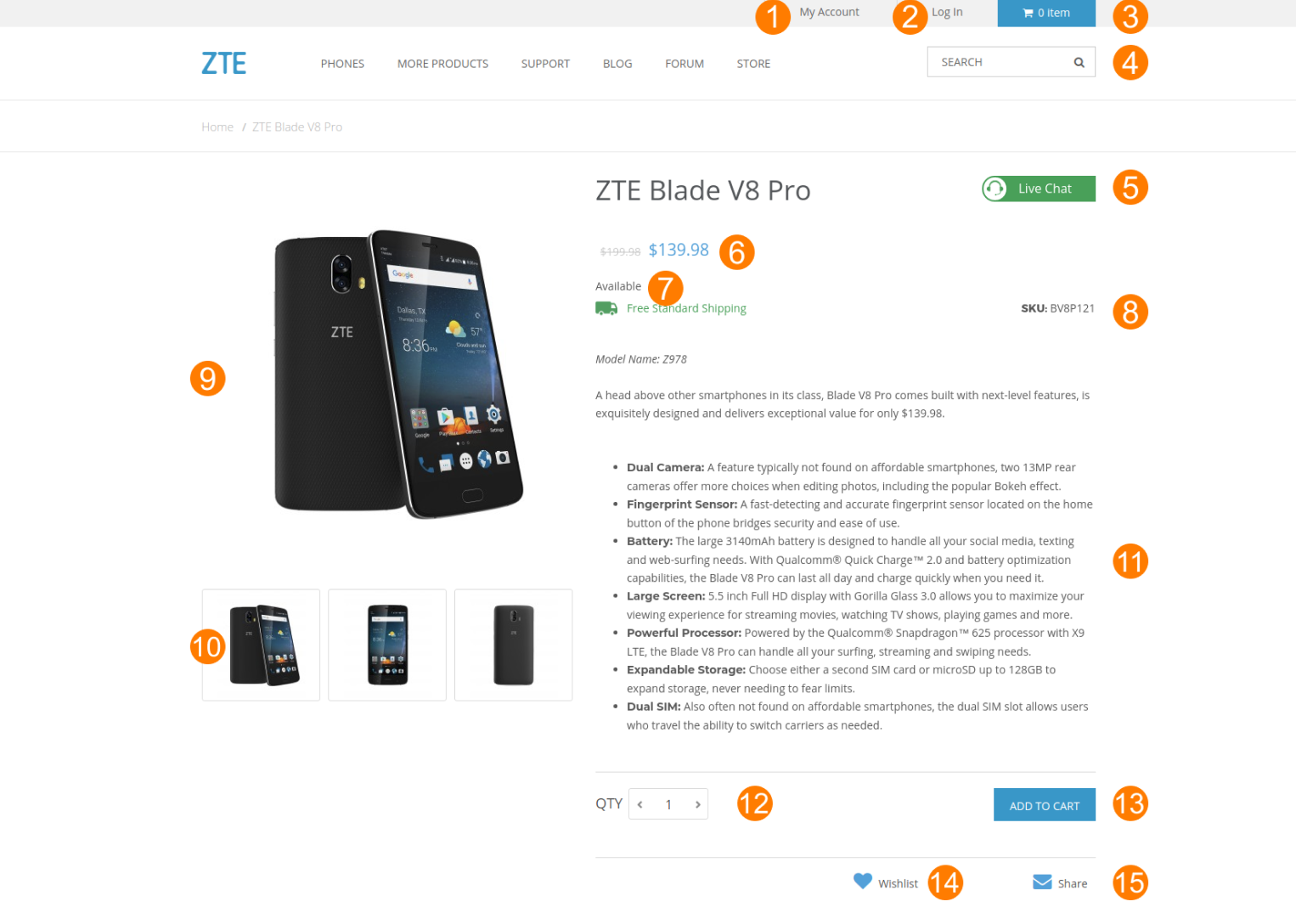
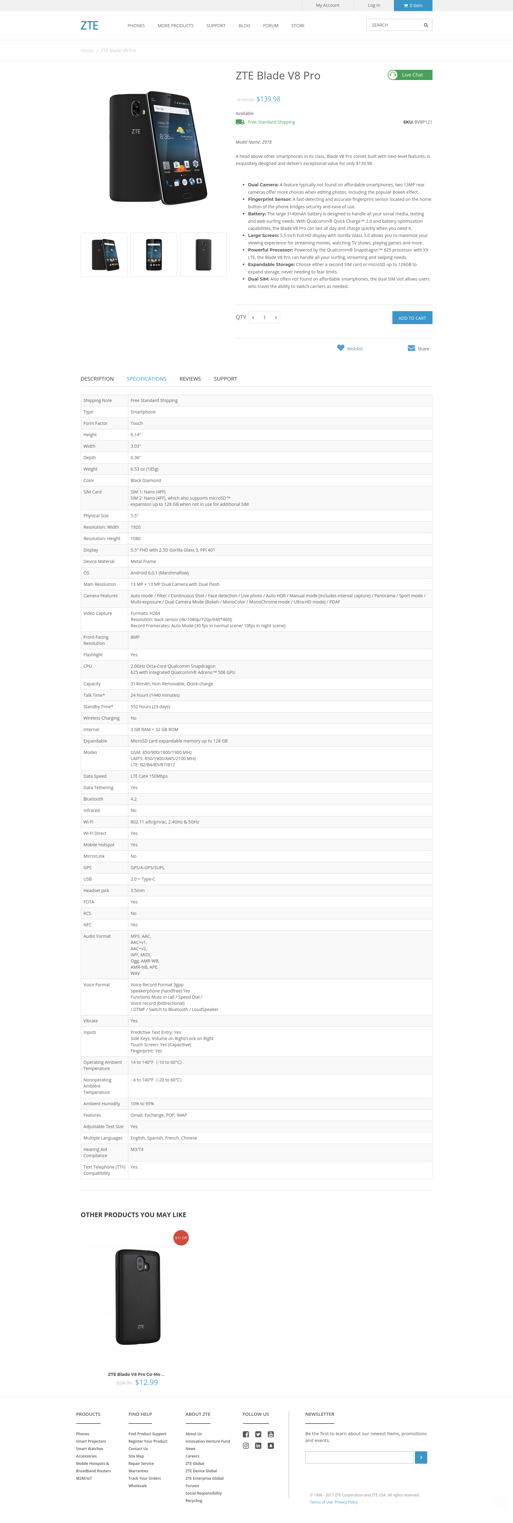
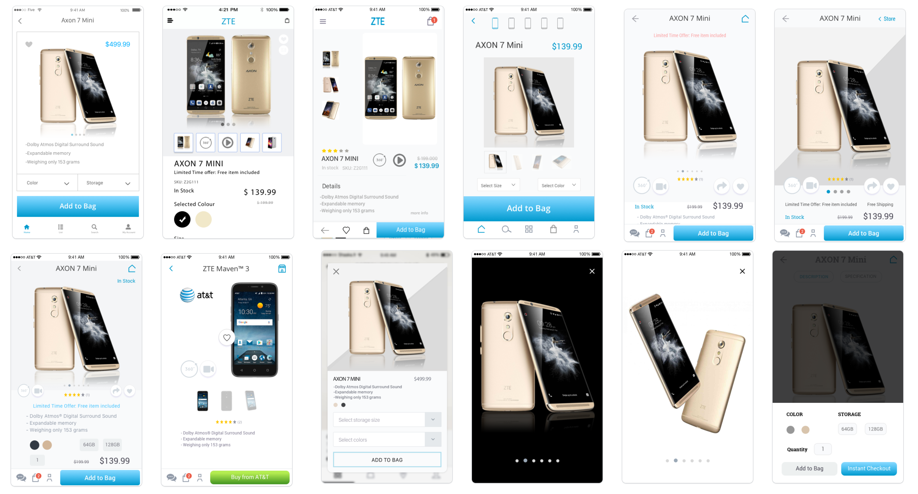
Before
Product Description Page (PDP)


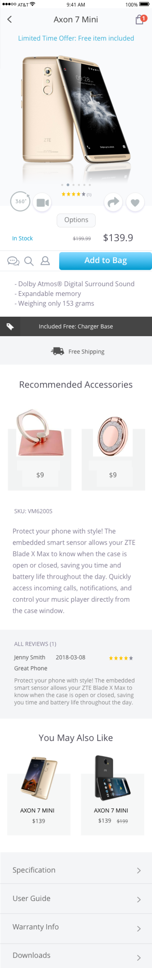
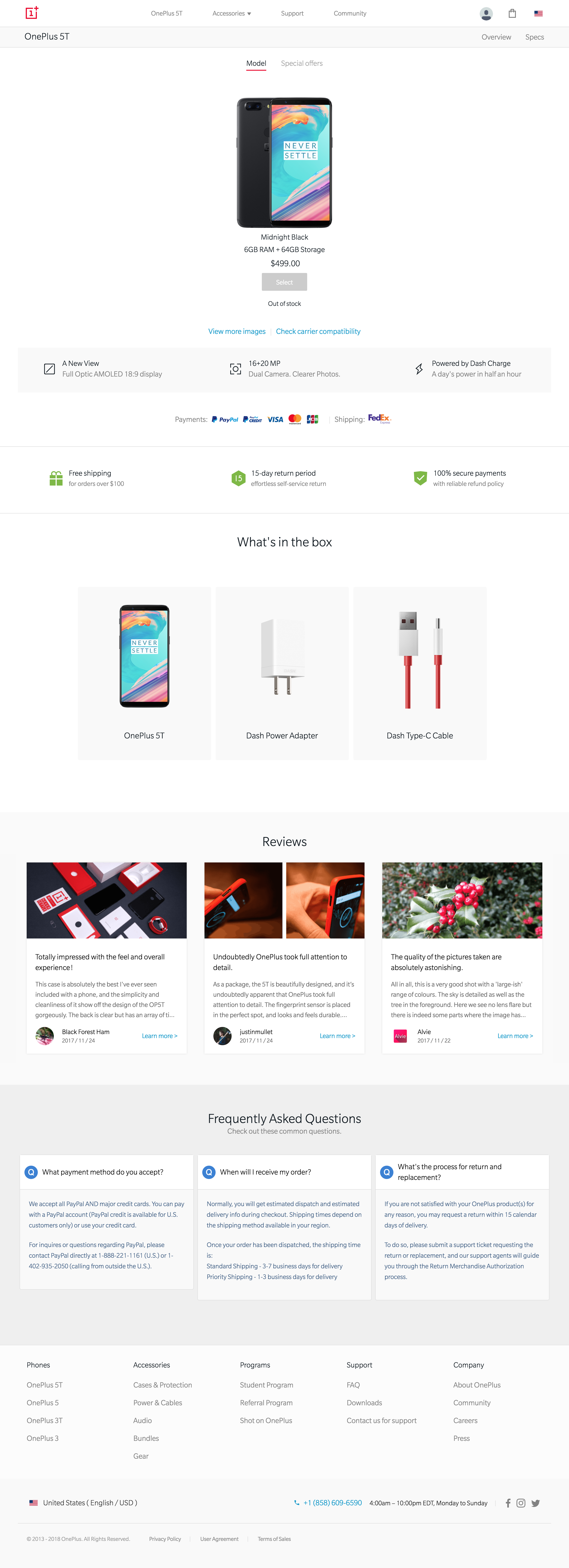
After
Product Description Page (PDP)
Discovery
Heuristic Evaluation | Stakeholder Interviews | Competitive Analysis
Heuristic Evaluation
Heuristic Evaluation was used to inspect the previous PDP by applying UX design principles. Through this process, we have identified several usability problems and opportunities for improvements.
Stakeholder Interviews
10 stakeholders from different departments were interviewed, including VP, managers from marketing, customer service, and IT departments.
Through this process, I have learned some valuable insights and the consensus of the importance of redesigning PDP as modern, professional, and easy to use and buy.
Competitive analysis
We conducted a competitive analysis of ZTE's website to three of their main competitors in the US market - Apple, Samsung, and OnePlus, as well as several e-commerce sites.
We compared the UI, features, content, structures and several elements on the PDP and see how ZTE USA ranked in the key areas.


Research & Analysis
Analytics Review | Content Inventory | Content Audit | Card Sorting
User Interviews | User Personas
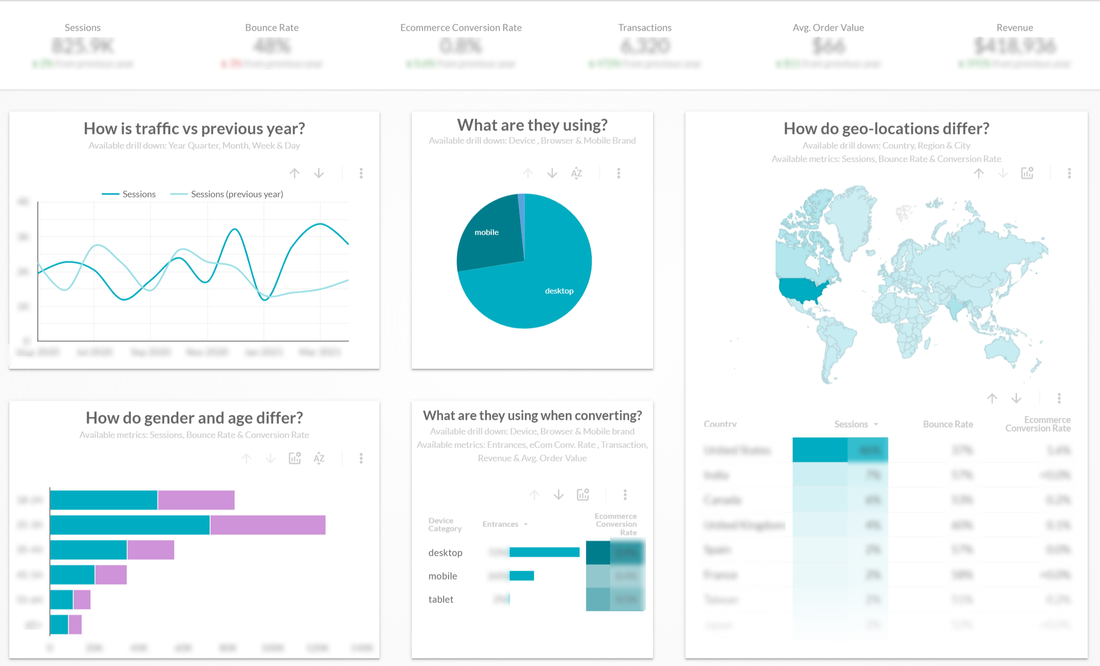
Analytics Review
I looked into the data on Google Analytics to analyze PDP's page performance in relation to a purchase. In addition, I also looked into drop-off rate, bounce rate, session duration, CTA conversions, device, and other user behavior metrics to identify issues and pain points.
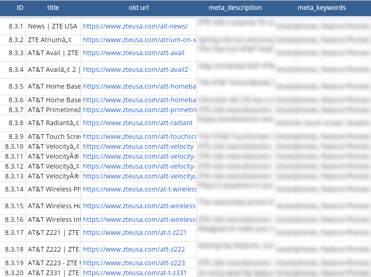
Content Inventory | Content Audit
Content inventory was created to list every piece of digital content on zteusa.com. Followed by a content audit to examine, evaluate and uncover content that needs updating or removal.
![]()
I put my glasses on and I still couldn't read the description.
— Melissa, 55 yrs![]()
![]()
It is very difficult to shop on zteusa.com using my phone.
— Bederson, 29 yrs![]()
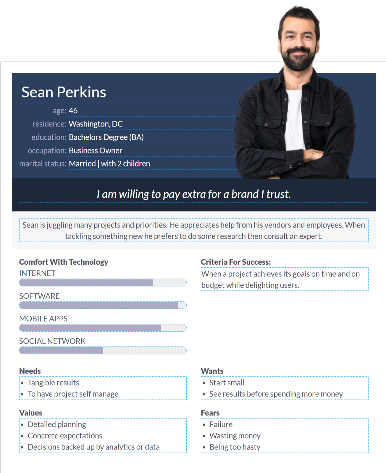
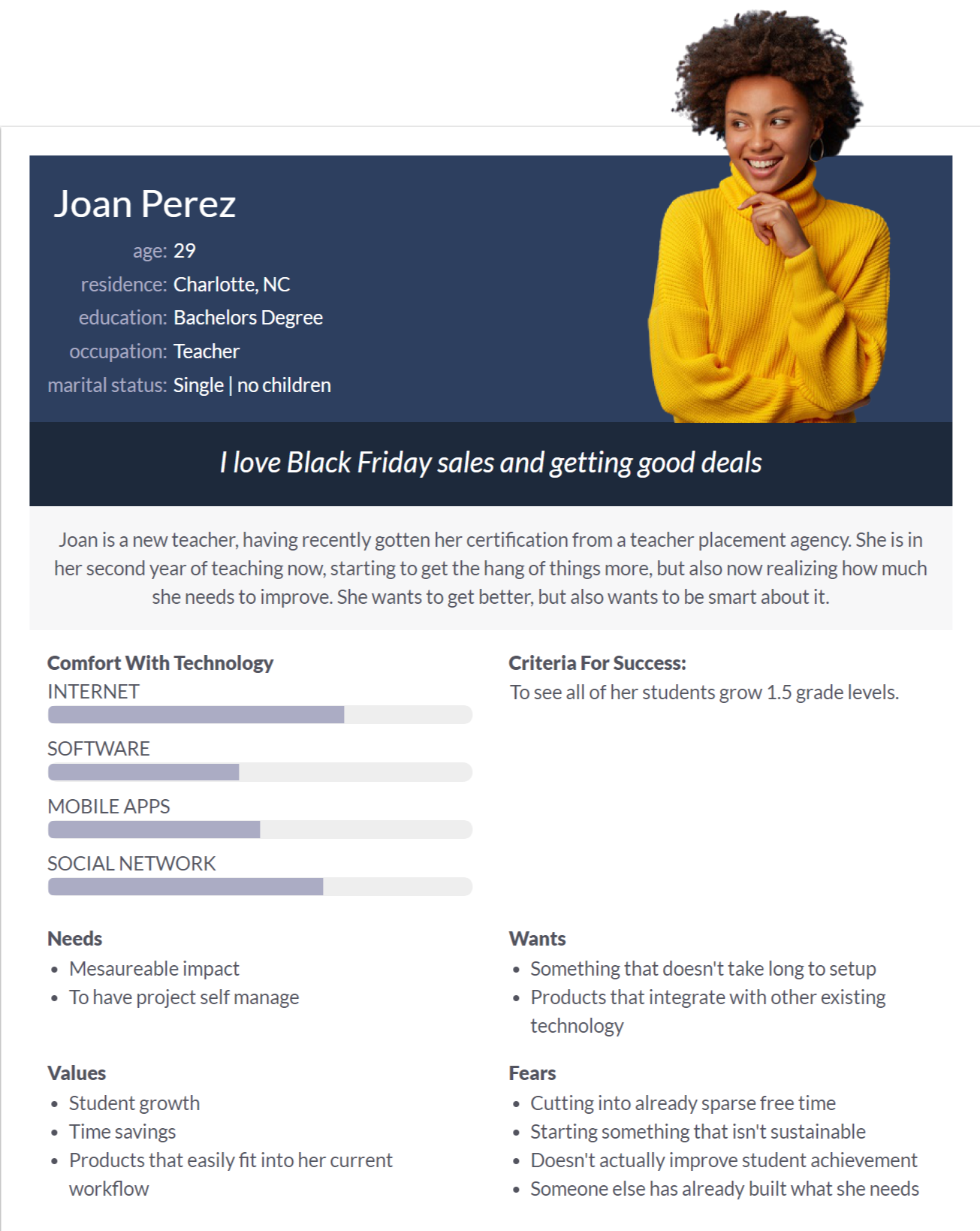
User Personas
A couple of User Personas were create based upon our research and discovery in order to represent the different user types that can help understand our users' needs, experiences, behaviors and goals.

Design
Wireframes | Prototypes
Wireframes
An initial round of wireframes was created for review. However, the client expressed desires to see something more visually appealing, so we went ahead and moved on to high-definition prototyping.
Prototypes
Per the client's request, instead of using wireframe for layout and placements, I created several PDP variations with different element placements and priorities.
Evaluate
Interactive Prototypes | User Testing
Interactive Prototype
After numerous rounds of iterations, I built an interactive prototype that could show how the finished PDP would look and flow.
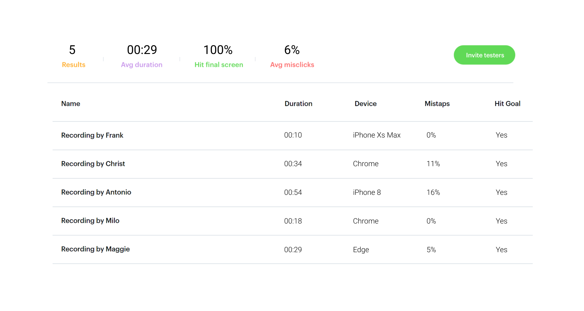
User Testing
We implemented the interactive prototype to run explorative online user testing with 5 participants to check functionality, design, UX, marketing, and get feedback. Overall, participants were able to complete the task in a relatively short timeframe.
The
Here is a list of some UX/UI solutions implemented to improve the overall user experience.
Click on the numbers to read annotations
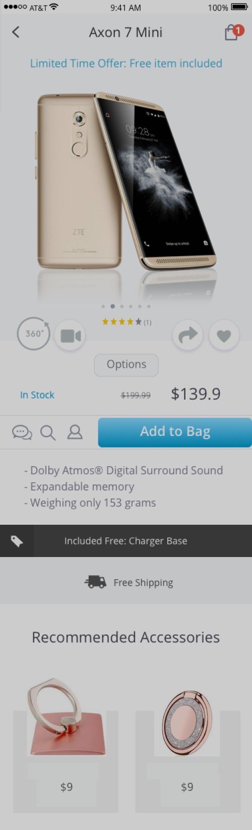
Simplified header shows only the product name and 2 key icons
Create urgency with prominently displayed limited time offers to entice decisive purchase action
Large and beautiful product photos that are scalable, detailed, and high-quality, can convey the value of the product and help to convert shoppers into paying customers
Elegant dotted indicator informs currently active image & additional product images
Display customer reviews/ratings to build trust
Increase sale conversion with additional 360º panorama view and product video
Add to favorite and social share buttons that can help shoppers create reminders of items for potential future purchases
Slide-up overlay displays options for color, storage, quantity & instant checkout
Display updated stock status to inform availability or create urgency when low in stock
Compare the actual and the discounted price can trigger buying decision
Floating bottom navbar for quick access to key features
Big colorful CTA button always stays above fold to compel shoppers to act
All crucial elements are shown above this fold line
Display product's key selling points/features
What's included in the product package
Display free shipping info as it usually improves conversion rate
Cross-sell products that complement the current item to encourage additional purchase

Outcomes
-
Increased Sales
from online orders through the redesigned Mobile-First store
-
Shorter Time to Complete Order
The new "Instant-Checkout" feature provides a faster way for return customers to order with a minimum of 2 clicks, which significantly reduce time to complete an order
-
Reduced Requests to Call Center/Live Chat
one of the goals was to let users find information online directly without overwhelming the call center & live chat
-
Improved Analytics Data
data showed longer session duration, and increased conversion rate