Client
Reimagined
Workday - Scorecard
Responsibilities
I am responsible for the end-to-end product design from start to finish; from gathering UX research to facilitating ideate workshop; from driving project management to providing solution design through progressively iterating and improving the product experience.
Before
Scorecard
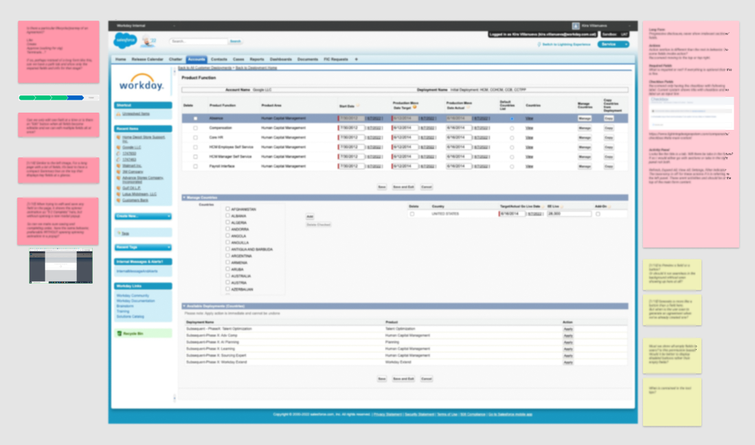
Salesforce Classic
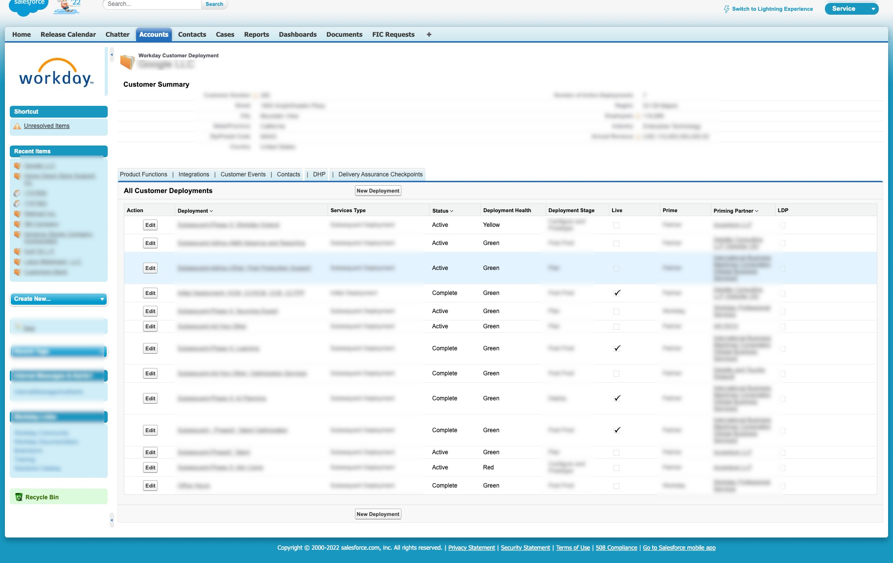
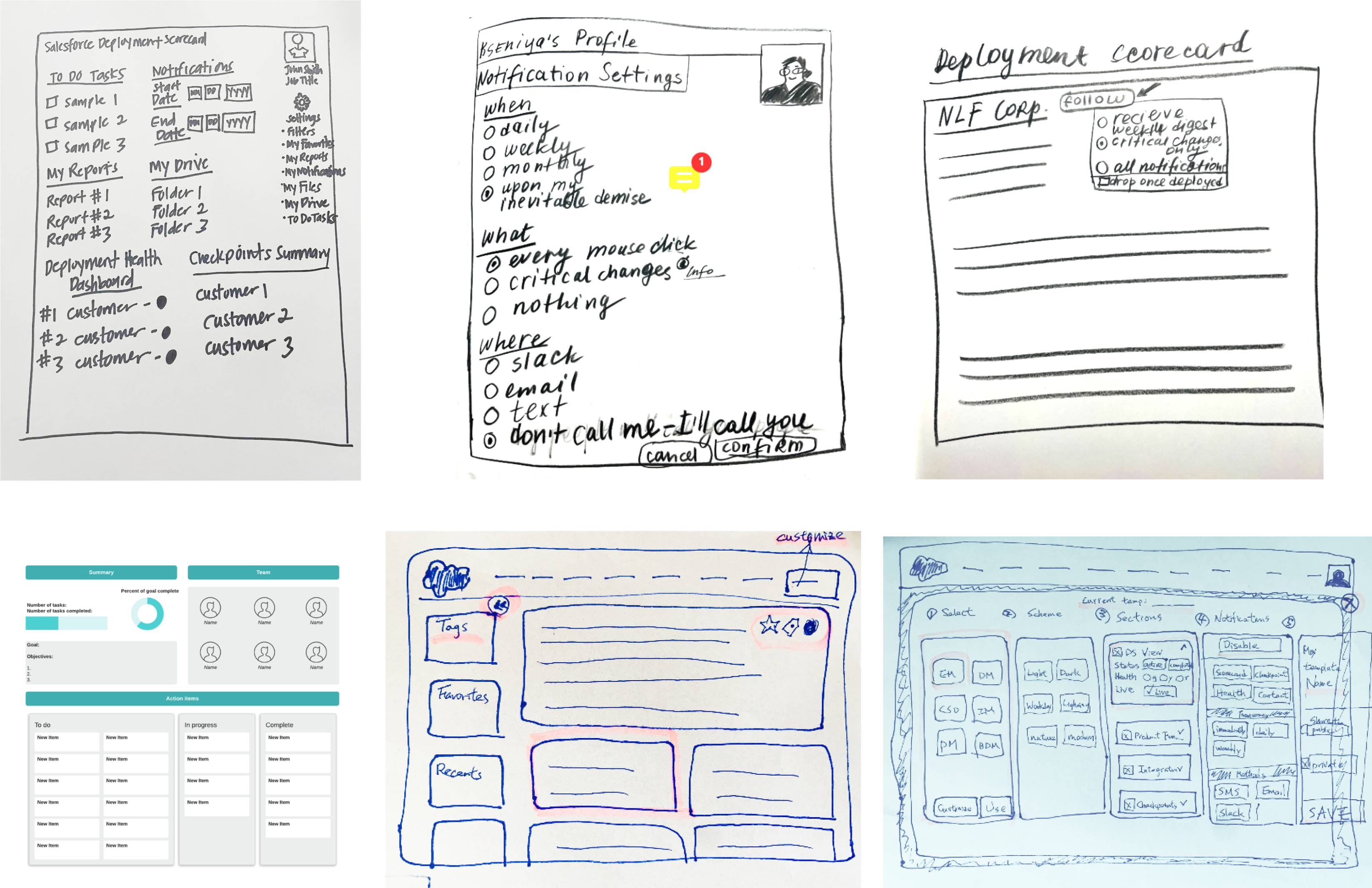
What is Deployment Scorecard?
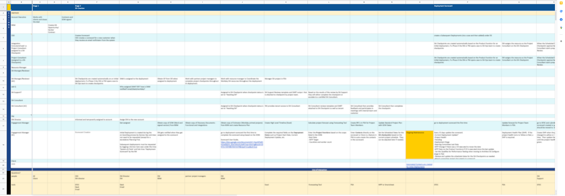
The Deployment Scorecard is a custom Salesforce app used by the business to track the lifecycle of every deployment made for customers- by Workday as well as partners.
Identified as the top priority among the 11 apps, Deployment Scorecard is used by 24 user profiles with over 2000 internal users. And the key functions of Deployment Scorecards are:
- Validating that the deployment is following Workday’s proven deployment methodology.
- Using tools and expertise learned from prior deployments, identifying potential issues and risks early.
- Mitigating project risks, providing guidance and options
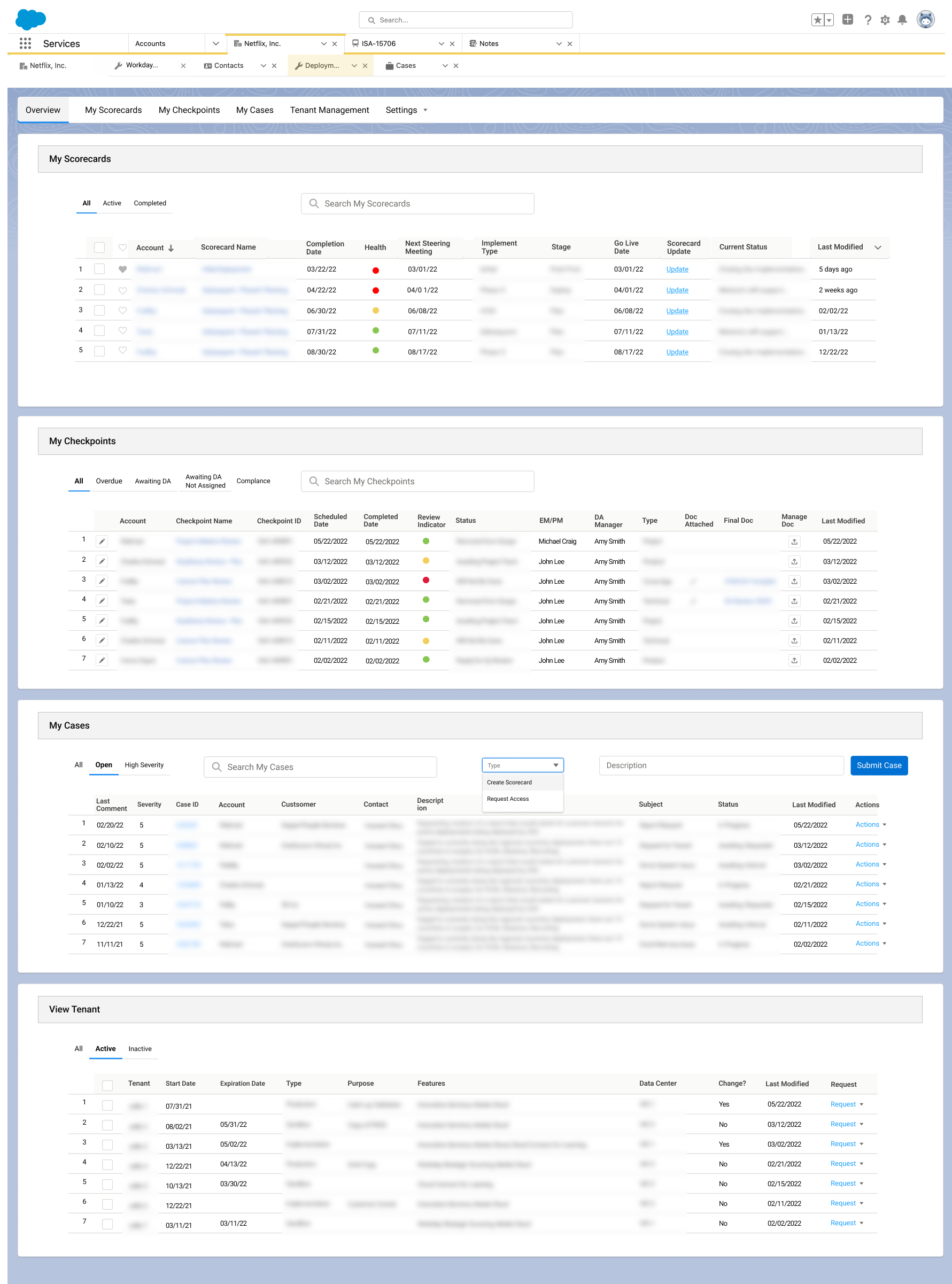
After
Scorecard
Salesforce Lightning

Discover
Usage Metrics | Heuristic Evaluation | Stakeholder Interviews | User Interviews | UX & Business Requirements
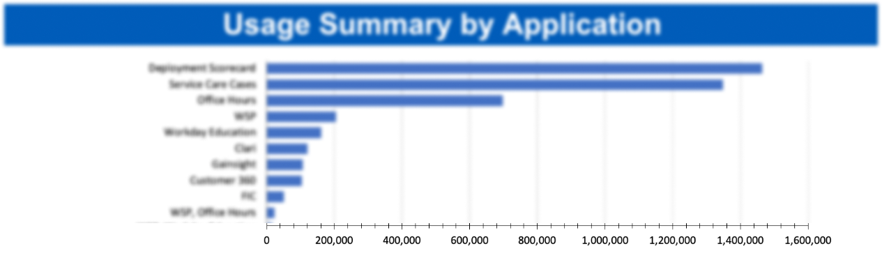
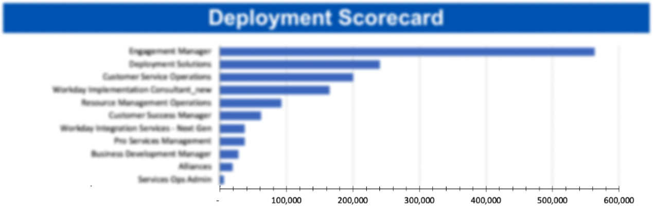
Usage Metrics
Our first step was to review the usage metrics provided, which can give us better insights on how these 24 user profiles from Services engage with the Deployment Scorecard and the 5 main components.
Stakeholder Interviews
13 stakeholders from different departments were interviewed, including Manager, Sr. Manager, Director, Sr Director, and Vice President.
This process helped us understand project priorities and direction, confirmed business goals and expectations, and identified user needs, pain points, and technical limitations, and most importantly, defined success and how to measure it.
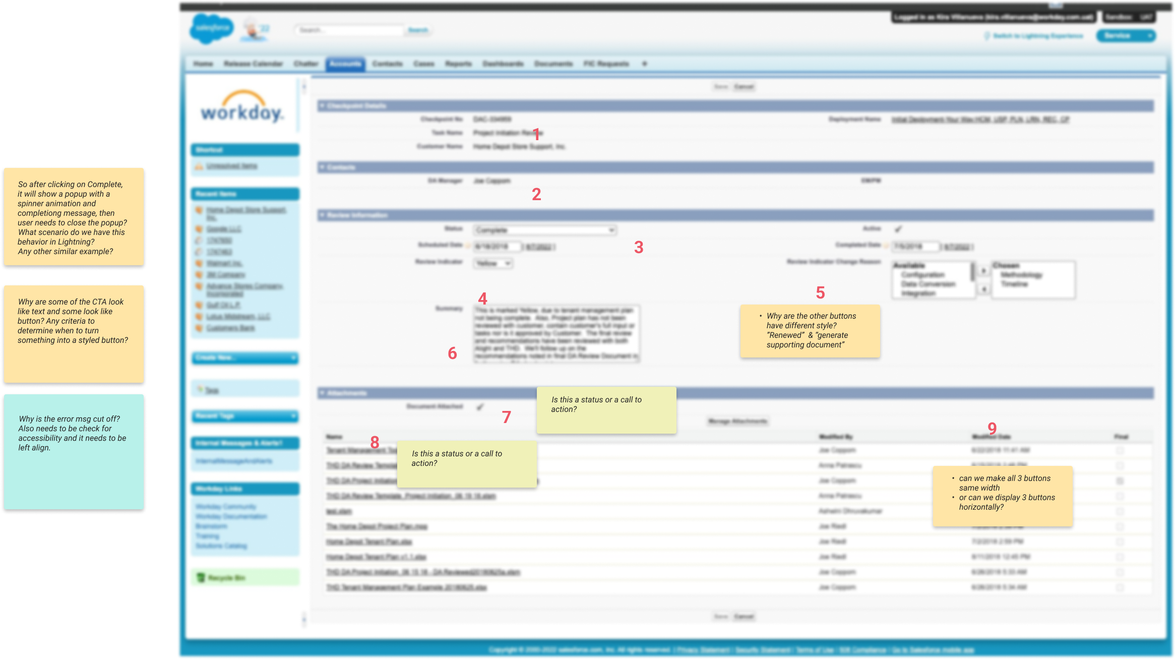
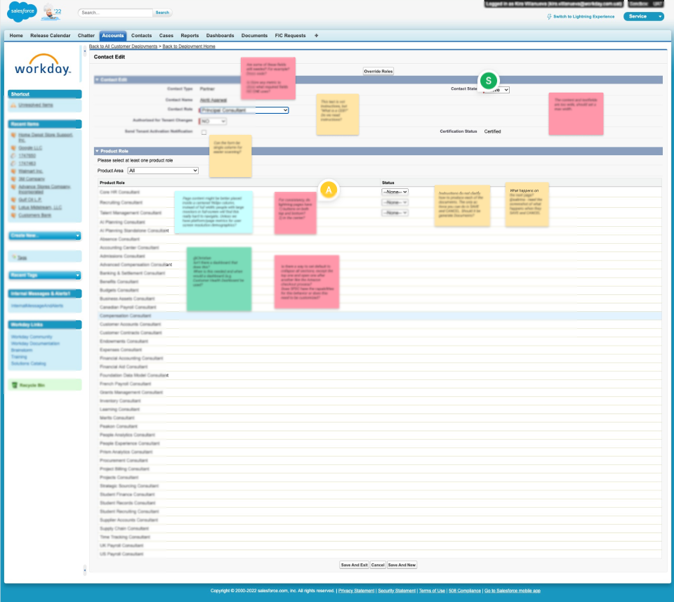
Heuristic Evaluation
We dedicated ourselves to a conscious, deep analysis of the current Deployment Scorecard.
The following is a fraction of screenshots highlighting our notes and suggestions for some the pages.
View Scorecard
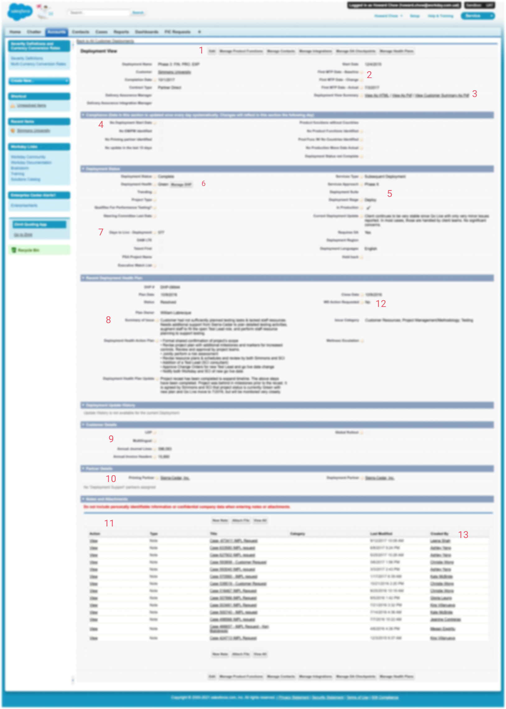
DA Checkpoints
Edit Contacts
Manage Countries

![]()
All of this stuff up here......, is just noise to me.......
— JK, PEM![]()
![]()
I decided that my life was worth more than that - than manually put the data in 451 times.....
— JP, Director, EM![]()
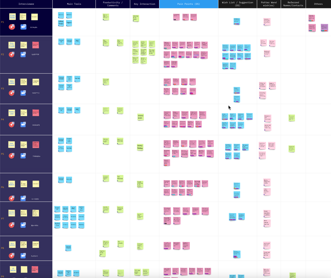
User Interviews
20 one-on-one online user interviews with participants with different user profiles were conducted to get an understanding of the holistic experience of the users and learn more about their daily task and interaction with Deployment Scorecard, which has helped me in prioritizing the pain points that should be addressed.
![]()
If I can only make the emails go away......
— IJ, EM![]()
![]()
I bet there is ways to do it, but I just don't know how.
— KW, Consultant![]()
![]()
I'm hoping that there's a portal at some point where we can get all that information, a one-stop. shop.
— HC, Project Director![]()
UX & Business Requirements
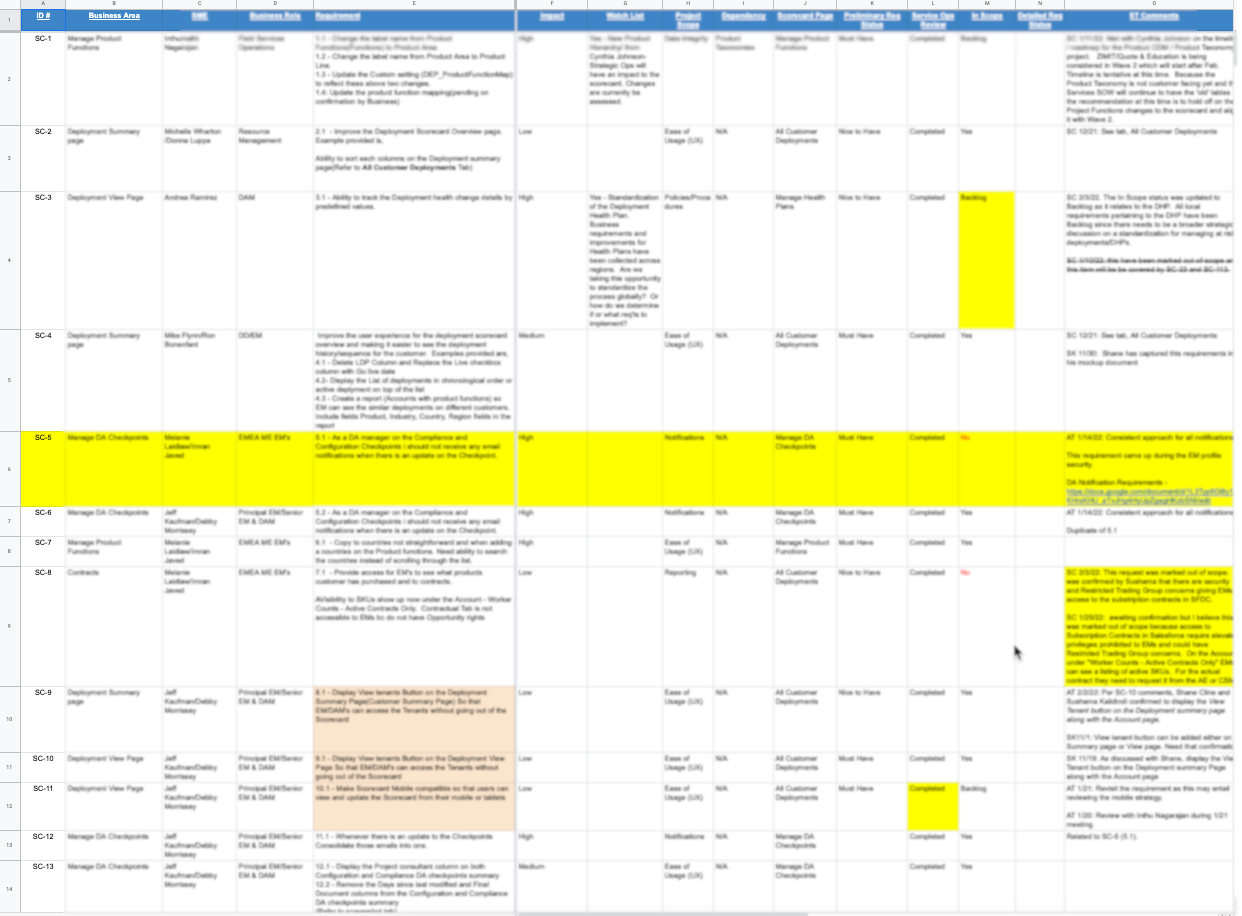
The business team has conducted discussions and group interviews to collect all aspects of business requirements for the initiative, and created a Business Requirement Document (BRD) with 141 requirements just for the Deployment Scorecard. By understanding and aligning the UX requirements with the business requirements, I have worked closely with my team to deliver a UX with a user-first approach that delivers the project in keeping with the goals of the business.
Define
Affinity Mapping | User Problem Statements | Service Blueprint
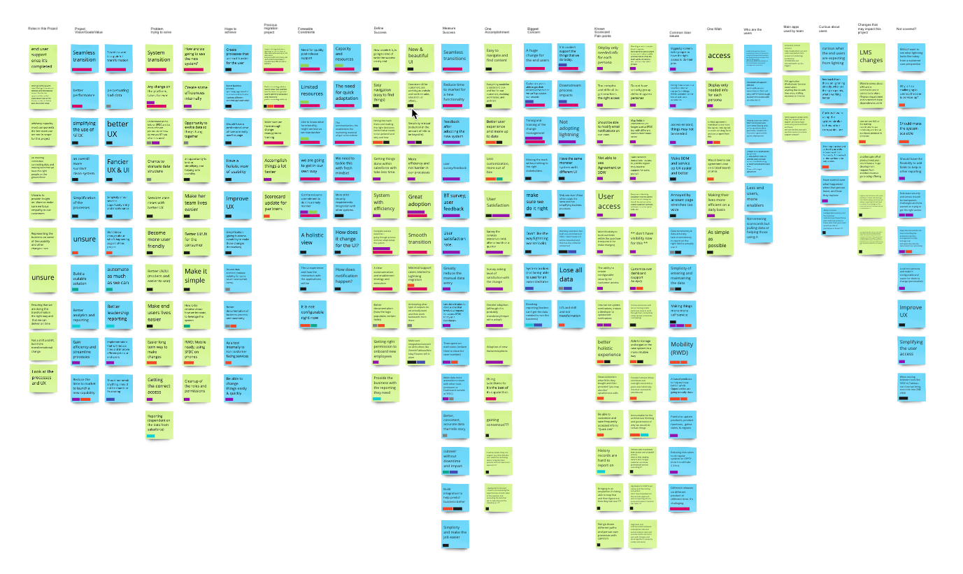
Affinity Mapping
After going through all the interviews and turning them into sticky notes in Miro, I used Affinity Mapping technique to help grouping and clustering notes into similar themes in categories.
And the 5 main themes were:
1. Findability
2. Manual “Flaw”
3. Reporting
4. Re-evaluation
5. One-stop Shop
Service Blueprint
During the define process, we realized that Deployment Scorecard is a complex, multi-layered process that involves lots of people, personas and components. So I created a Service Blueprint template and invited other teammates to collaborate to help everyone get a holistic view of the Scorecard processes that can be directly tied to touch points in a specific customer journey.
Ideate
Brainstorm Sessions | Design Thinking Workshop | Sketches
Brainstorm Sessions
As we started to move forward to the Ideate stage, I began to facilitate and lead a bi-weekly (twice a week) collaborative brainstorming sessions with a multi-faceted to set expectations, review problems we want to solve, identify potential risks and technical restrictions, share possible solution ideas, and prioritize activities.
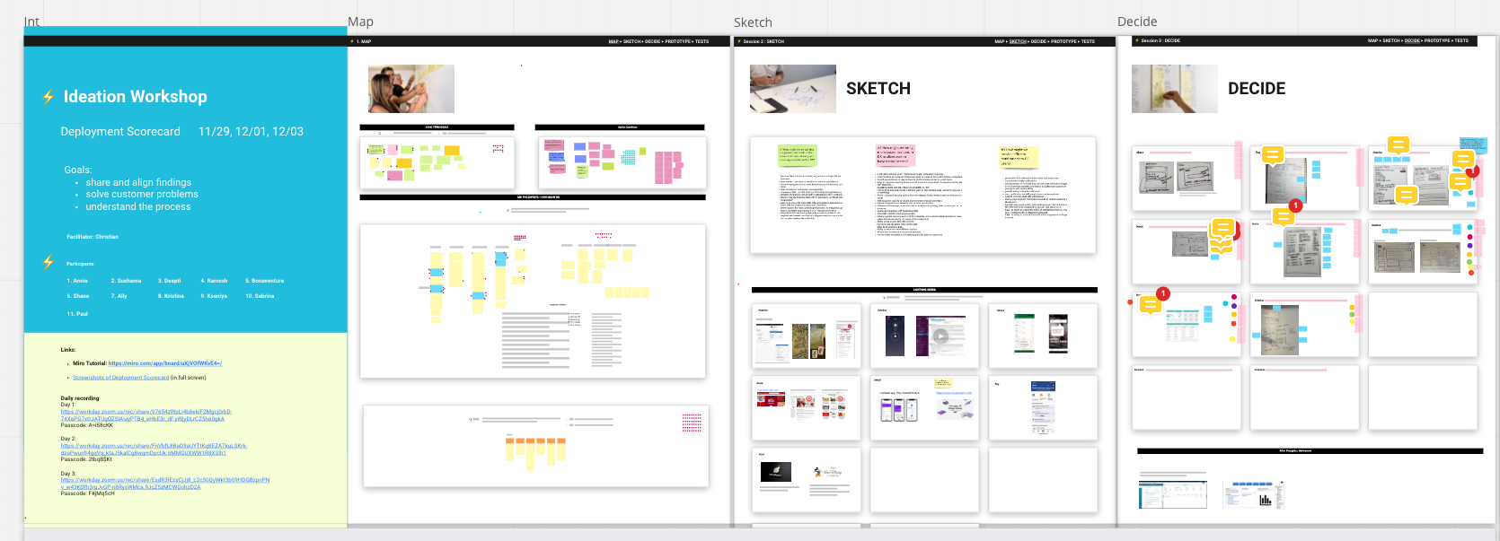
Design Thinking Workshop
We've conducted a 3-day ideation workshop / design sprint with the core team from the Service Lightning Migration project to form a cross-functional team.
The original 5-day design sprint process was developed at Google Ventures.
With limited time available, we had to trim it down to 3 days, 2 hours each
So on day 1, we mapped out the optimistic and pessimistic future and the shared findings
On day 2, we began to sketch out some solution ideas and then review and voted on them on day 3
Goals:
share and align findings among us from UX interviews, functional interviews as well as analysis from the reviews
help everyone understand the process better
brainstorm on ideas to solve users’ problems

Design
Micro-interactions | Design Documentation | Interactive Prototypes | Iterations | Cognitive Walkthrough
Micro-interactions
Micro-interactions are small, functional animations that support the user by giving visual feedback and displaying changes more clearly.
As many users expressed their impression of Salesforce Classic as dated and boring, I suggested to add some micro integration to make the new migration interesting and up-to-date.
Design Documentation
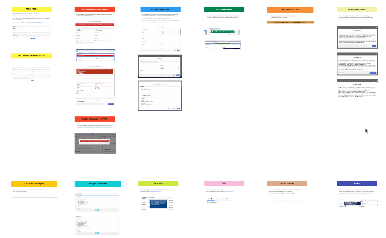
When it comes to design guidelines in the Salesforce Lightning Design System, there could be several options to choose from. To ensure a consistent experience throughout different Salesforce app in Workday company-wide, a best practice document has been created to share among multiple teams that are working on various Salesforce Lightning migrations at Workday.
The
Here are some UX/UI solutions implemented to improve the overall Deployment Scorecard user experience.
My Portfolio-based Dashboard
From the user interviews conducted, many users expressed frustrations on the constant going back-and-forth between multiple tabs/pages in order to get the data needed. And the idea for having a one-stop shop emerges with the vision to display all the accounts the user is managing on the same screen.
This is a brand new concept that is not currently available. And after conducting cognitive walkthrough with 10 users, including several product and domain owners, the feedback I received were overwhelmingly positive.
New Scorecard
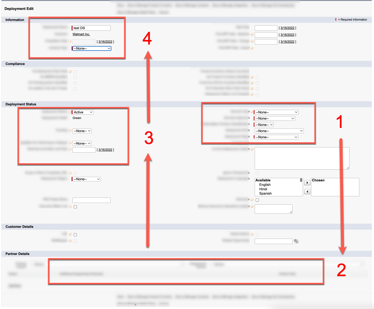
One of the big surprises during the user interviews, came when I observed how "New Scorecard" is being created in Classic. As most of us usually start filling out a form from left to right, then up to down, these BA ops users actually were following the same pattern - they started from the right (1) to down (2), and then move left (3) to up (4).
So why did they do this?
This is because there is a pattern for scorecard name, and users need to select the fields on the right (1) first, so they can use them as visual cues to type the long scorecard name manually.
In the new design, I have grouped these fields to the left, right below scorecard name and added the feature to automatically create the scorecard name according to the options selected.
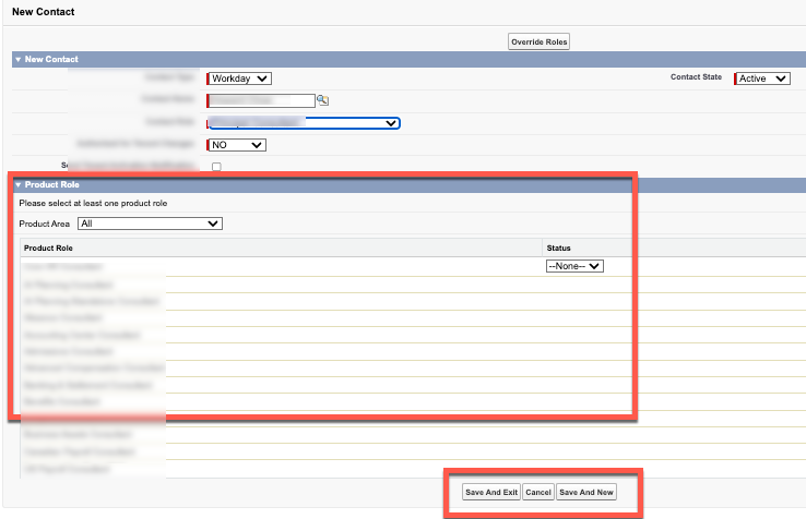
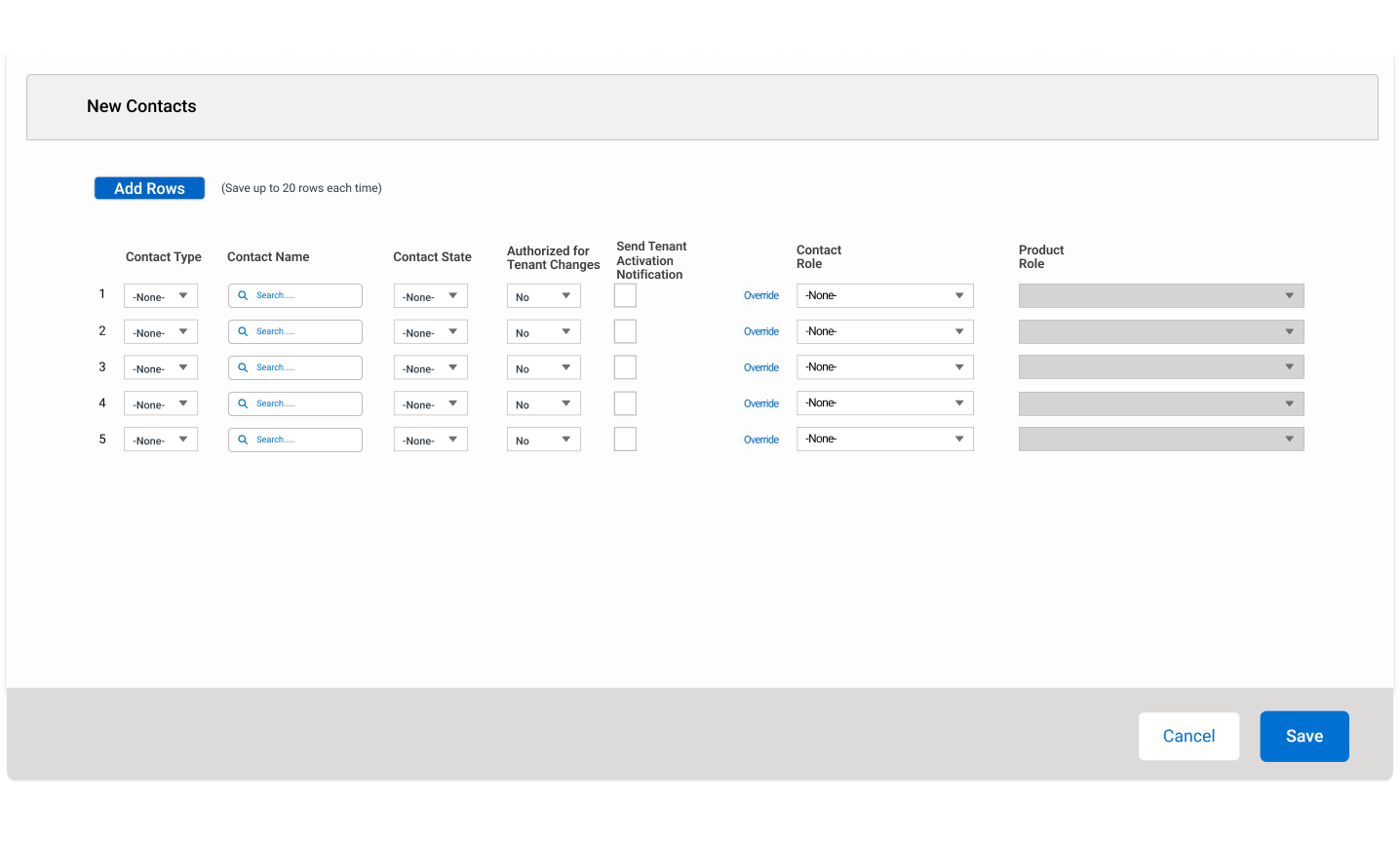
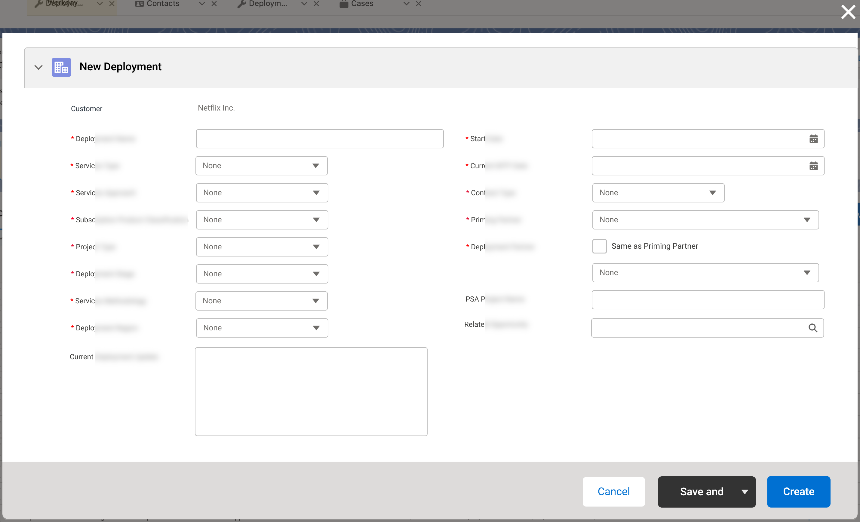
New Contact (bulk)
Another key pain point is related to bulk action. Currently in SFDC, users can only create one contact at a time, but in many use cases, they may need to create 20 contacts from a single request, which may lead them to click on the "Save and New" button 20 times.
In the new design, users can save up to 20 contacts each time, moreover, the new interface eliminates all the redundant information and uses a multi-picklist for Product Role.
Result
-
One-stop Shop
A new portfolio-based dashboard will be presented as they login to Salesforce Lightning. Many reviewers expressed if they can only wish for one new feature for the migration, this will be IT.
-
Improve productivity and simplify processes
Over 200 improvement will be implemented to simplify process and improve user experience on performing various tasks in Scorecard
-
Time saver for Bulk actions
Several Bulk Action Features have been implemented which can now save some users from tasks they used to do repeatedly 461 times.
-
Findability
Sorting, pre-filters, search bar have been implemented within different Scorecard components to provide multiple ways for users to find the information they need. Moreover, Account quick summary and Scorecard quick summary panels have been added to all Scorecard pages to display key information at a glance.
-
Constant Feedback / Agile design
Some of the current feedback we receive from reviewers are extremely positive and show excitements about the new changes and improved UX:
"This is BIG, and exactly what we want for years!"
"Portfolio-based dashboard, I think that is a very, very good concept."
"Being able to sort information, and being able to go to MY CASES is BIG!"
"Looks good, collect the right info, make sense and would be time-saving."
"This is significantly way better."